Collusion.com was a totally new, first of its kind brand launched by ASOS in October 2018.
When I joined the project just a couple of months earlier the website design was still in a conceptual phase and with very little development work started, so the challenge to deliver something to the hard October 1st deadline was as much about prioritisation as anything else.
After some incredibly tough months both before and after the initial launch though, the finished product I think speaks for itself.
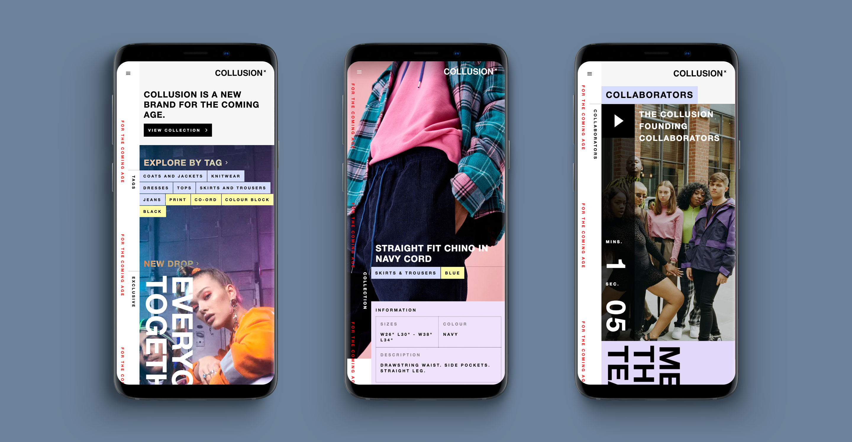
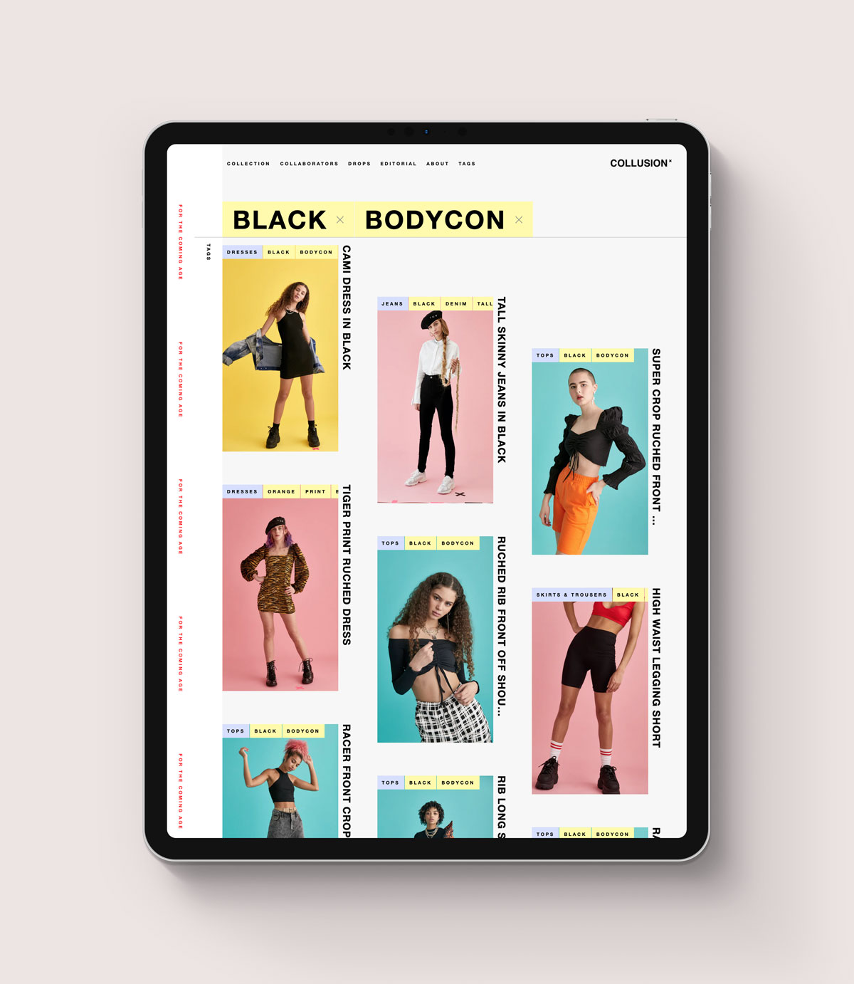
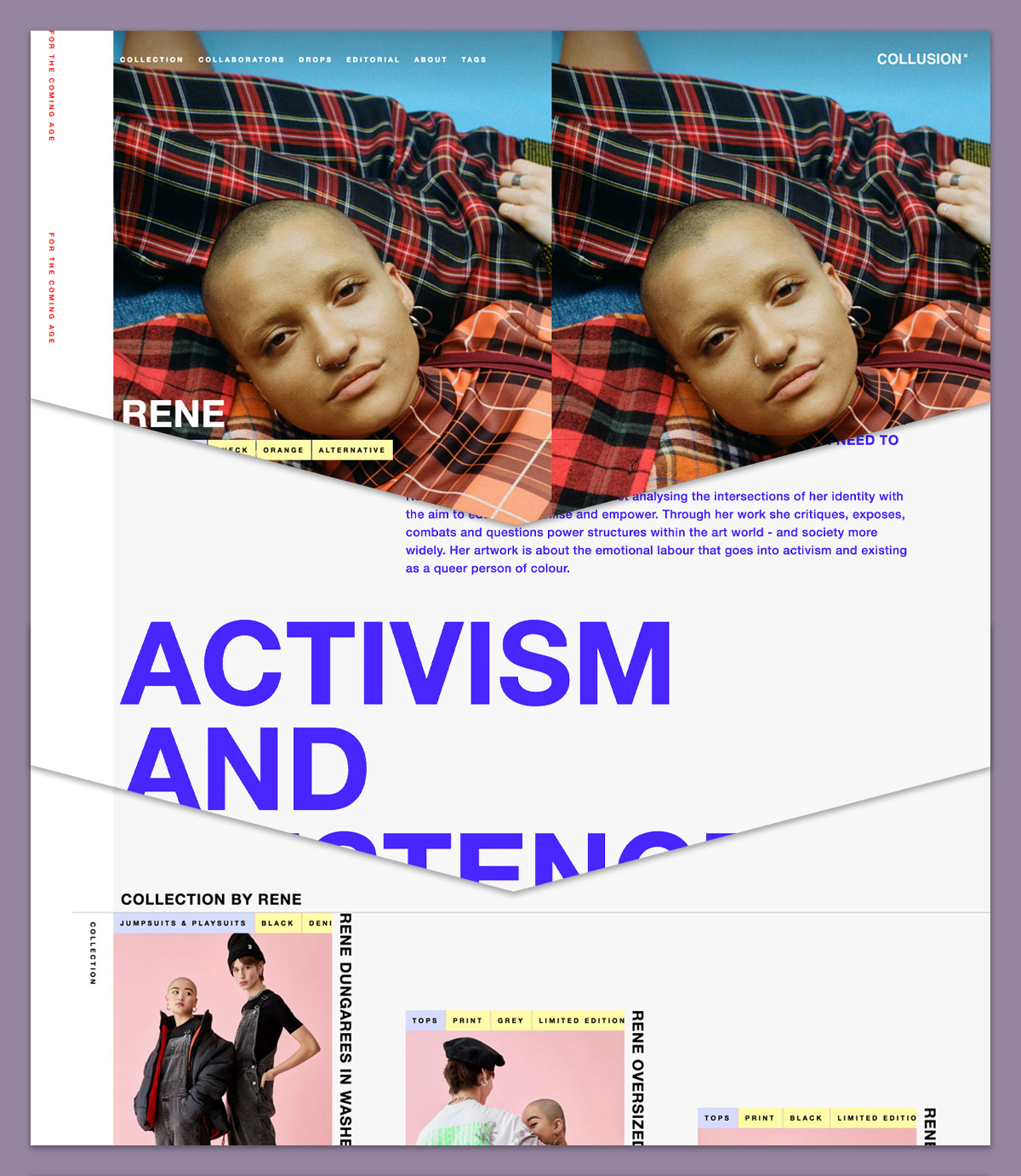
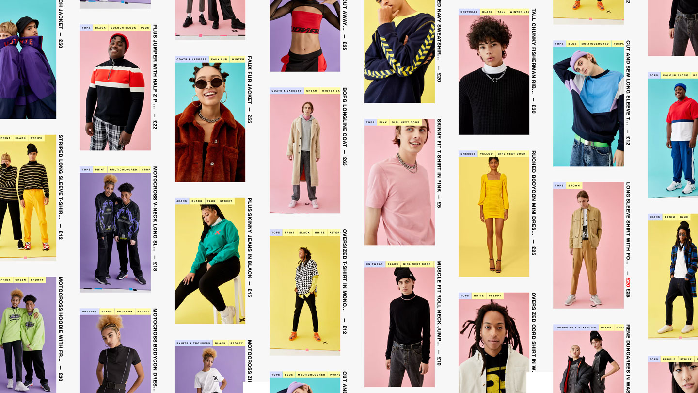
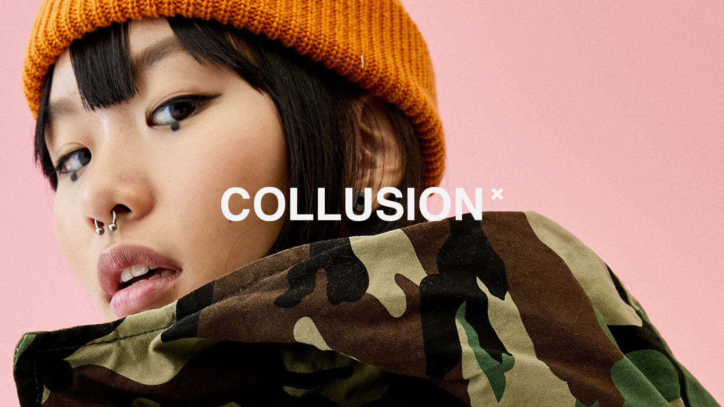
As a youth-focused brand the site was built to an fearlessly modern design, brought to life with full-bleed images, innovative typographic treatments, and motion.
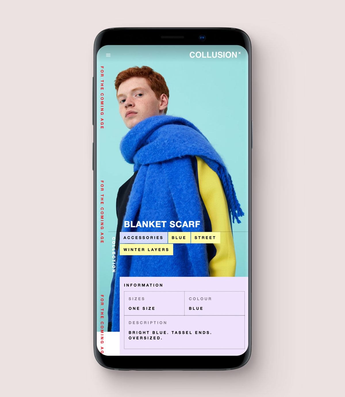
The design and development wasn’t just responsive, but relentlessly mobile-first to bring a rich, beautiful browsing experience that works well within the physical and network constraints of a portable device.
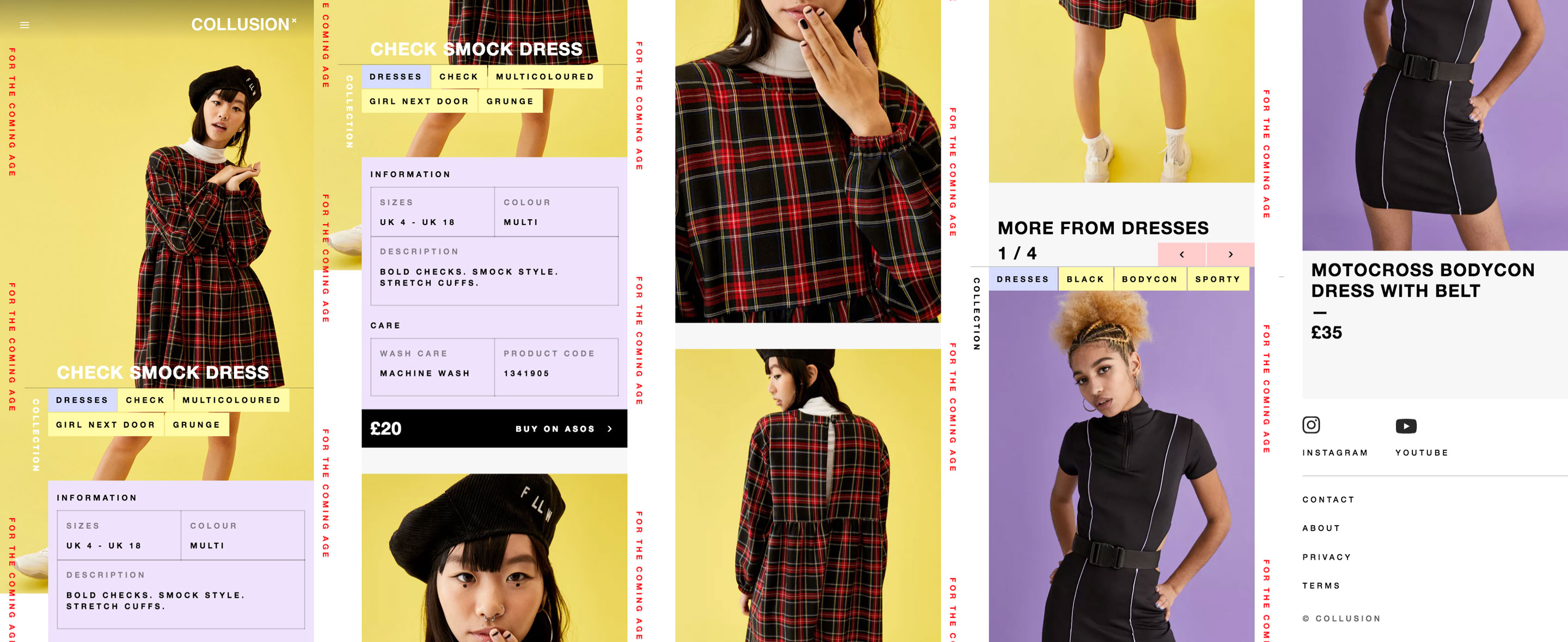
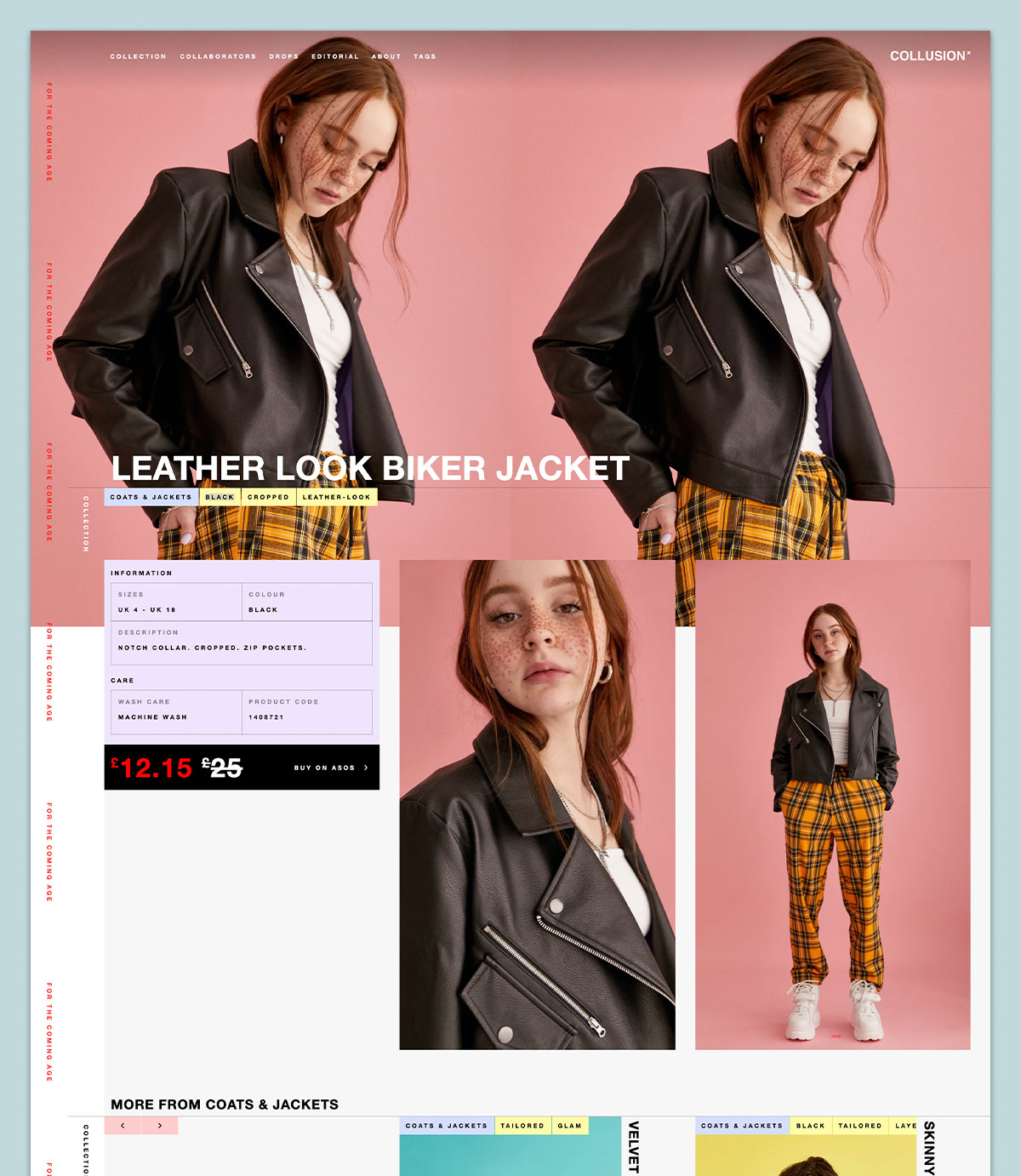
On tablet and desktop resolutions we tiled the hero image to replicate the take-over effect even on wider devices.
We used responsive image sourcesets to optimise loading time and image presentation.
To power the site, we built a custom headless Node.js CMS on top of open source software which allowed every element of the website to be created and connected together.
Products could be tagged with the people who designed them, the ‘drop’ or release they were part of, plus freeform tags to describe the type and style of clothing. Similarly editorials could be tagged with the author who wrote them, drops could be associated with free-form tags, etc.
And all of these associations flowed both ways so a web of connections was quickly built up to allow different forms and directions of navigation; from people to product, product to drop, drop to tag, and so on.
